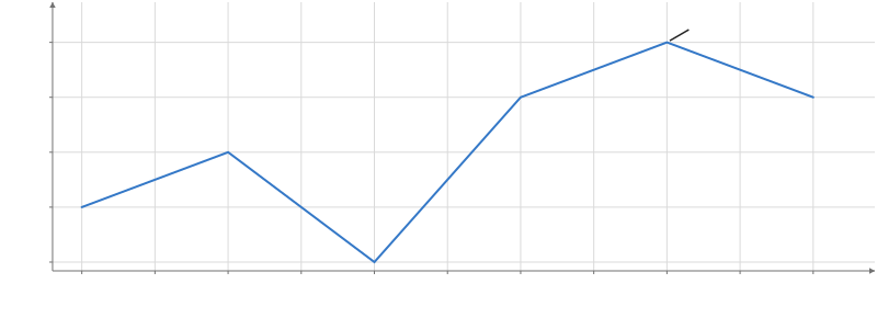
A note a fixed distance from a point, with a leader line to the point.
Options
Options
textstring | number | column | (string | number)[]- The text: a string or a number, or a column of them for a callout per row.
dxchannel- How far right of its point the text sits (left when negative): a number or a column. Default:
24 px. dychannel- How far below its point the text sits (above when negative): a number or a column. Default:
-24 px. boxboolean | {fill, outlineColor, outlineWidth, padding, radius, opacity}- A box behind the text: true for white with a gray outline, or its style. Without one the text has a halo of the plot's background. Default:
false. leaderboolean | {color, width}- The line from near the point to the text (or its box): true (1.5 px in the text's color), false, or its color and width. Default:
true. align"left" | "center" | "right" | "auto"- How the text sits at its offset; "auto" puts each row's text on the side of the point it is offset to. Default:
"auto". fontstring- The text's font, a CSS font-family. Default: the plot's font.
Position
xchannel- The x of the point the callout points at: a number or a time draws one callout, a column one per row.
ychannel- The y of the point the callout points at.
Appearance
fillchannel- The fill color: a CSS color, or a column of numbers or categories mapped to colors.
colorchannel- The text's color: a CSS color, or a column mapped to colors. Default: the theme's text color, as Text's.
sizechannel- The text's font size: a number, or a column mapped to sizes. Default: the theme's font size, as Text's (14 in the default theme). In px.
widthchannel- The line width: a number, or a column mapped to widths. In px.
opacitychannel- The opacity, 0 to 1: a number, or a column (categories map through opacityScale). Default:
1.
Scales
fillScalescale- The fill's scale, which marks can share: continuous({domain, colormap, transform}) for numbers, categorical({domain, range}) or ordinal() for categories.
colorScalescale- A scale for color that marks can share.
colormapstring | color[] | object- The colormap of a numeric fill or color: a name, a list of colors, or {colors, space, positions}. Default: the theme's (Viridis).
sizeScalescale- The size's scale, which marks can share: continuous({domain, range, transform}) for numbers (without a range, the automatic one), or categories with a numeric range.
widthScalescale- A scale for width that marks can share, as sizeScale.
opacityScalescale- A categorical() scale from the opacity column's categories to opacities, 0 to 1.
Display
labelstring- The mark's name in the legend and the settings pane.
legendboolean- Whether the mark has a legend entry. Default:
false. visibleboolean- Whether the mark is drawn. Default:
true. blend"normal" | "additive" | "multiply" | "screen" | "subtractive"- How the mark mixes with what is drawn under it; any mode but normal draws it transparent, and SVG and PDF exports draw additive and subtractive as an image. Default:
"normal". glownumber- How much the mark glows: its own color times glow blooms around it in the plot's presentation (0 does not glow); the Plot's bloom effect sets the bloom's strength and radius. SVG and PDF exports draw the whole plot as an image. Default:
0. shadeShadeSpec- A plugin's shade (registerPlugin): { kind, ...parameters }, as { kind: "hatch", spacing: 6 } (Python hm.shade("hatch", spacing=6)), recolors each fragment the mark draws; picking, tooltips, domains and legends are unchanged. SVG and PDF exports draw a shaded mark as an image.
optionsstring[]- The settings the settings pane shows for this mark, by name.
namestring- The mark's name in the settings pane, and the name facet.endpoint() and partition.endpoint() find it by.
Interaction
identityidentity- Whose rows these are for selections: an identity() shared by tables that show the same things. Default: its data's.
selectboolean | selection | object- Click to replace the selection; an exact repeat clears it. Shift/Meta/Ctrl-click toggles membership (whole series for Line, Area): true uses its data's selection, or give a selection(). input("root").set("id") writes an input instead: a click sets it to the clicked row's id (a drill-down's root), .set(literal(v)) to a constant, .reset() to its default, and a click on nothing restores its default (input("root", {default}), else a Select of that name's, else null); several marks may write one input.
hoverboolean | selection | object- Mark the row under the pointer as @hovered (a whole series for Line, Area), without fading the others: true uses its data's hover, or give a selection(). input("focus").set("series") writes an input instead: while the pointer is on a row the input shows its series (or .set(literal(v)), a constant), then its committed value again (a hover that would change this mark's own rows is an error).
tooltipboolean | field[] | object- Show the nearest row's values in a box by the pointer: true, a list of fields, or {fields, radius, content}. Default: the Plot's.
nearestboolean | selection | object- Mark the row a tooltip shows as @nearest, with or without the tooltip: under the pointer, else the nearest drawn row within radius pixels (a whole series for Line, Area): true, a selection(), or {selection, radius}. Default: the Plot's.
respondboolean | "selected" | "brushed" | "hovered" | "nearby" | "nearest" | selection | array- Which interaction states fade this mark's other rows to selectionOpacity; "hovered" fades them while hovering, "nearest" while a row is nearest. Default: the states it sets, except hover and nearest.
selectionOpacitynumber- The opacity of the rows outside the selection while one is active. Default:
0.25. onclick(event) => void- Called for click on this mark; row provenance is optional after transforms.
ondblclick(event) => void- Called for dblclick on this mark; row provenance is optional after transforms.
onpointerenter(event) => void- Called for pointerenter on this mark; row provenance is optional after transforms.
onpointerleave(event) => void- Called for pointerleave on this mark; row provenance is optional after transforms.
onpointermove(event) => void- Called for pointermove on this mark; row provenance is optional after transforms.
onpointerdown(event) => void- Called for pointerdown on this mark; row provenance is optional after transforms.
onpointerup(event) => void- Called for pointerup on this mark; row provenance is optional after transforms.
onpointercancel(event) => void- Called for pointercancel on this mark; row provenance is optional after transforms.
onpointerover(event) => void- Called for pointerover on this mark; row provenance is optional after transforms.
onpointerout(event) => void- Called for pointerout on this mark; row provenance is optional after transforms.
onpointermissed(event) => void- Called for pointermissed on this mark; row provenance is optional after transforms.
enterEffectboolean | "fade" | object- How rows that arrive in a keyed update appear: "fade", or {effect, duration, easing}. animate()'s enter option is the value a channel starts from.
exitEffectboolean | "fade" | object- How rows that leave in a keyed update disappear, as enterEffect. animate()'s exit option is the value a channel ends at.
Animation
animationboolean- Animate changes to the mark's values. Default:
false. animationDurationnumber- How long an animated change takes. Default:
300 ms. animationEasing"linear" | "quad-in" | "quad-out" | "quad-in-out" | "cubic-in" | "cubic-out" | "cubic-in-out" | "sine-in-out"- The animation's easing. Default:
"cubic-in-out".
Advanced renderer options
maxInstancesnumber | null- The most rows drawn; past it the rows are sampled (null draws them all), though SVG and PDF exports draw every row. Default:
null.
Usage
Glyph outlines are not supported. Style the border of a label box with box={...}.
A Callout points at a value with a note a fixed distance away: dx and dy pixels from its point (right and down; the default is up and to the right), with a leader line from just short of the point to the text. The text has no box: it is drawn over a halo of the plot’s background, so it reads over the data; box puts it in one (white with a gray outline by default), and the leader then ends at the box’s nearest edge. The leader is 1.5 px in the text’s color unless leader sets its own. The text takes the theme’s size and color, as Text does, the size rule and band labels use too. Numbers and times for x and y draw one callout; columns draw one per row, and dx, dy and text may be columns too. The text aligns to the side of the point it sits on (align="auto"), row by row when dx is a column.
Callouts do not move to avoid each other or the data: choose the offsets. It is a Text with a leader, so Text takes box and leader as well, and exports draw the leader, the box or the halo, and the text as vectors, the text searchable.
Callout is a built-in template, built from transforms and simpler marks: import it from hmplot/charts.