BulletChart
Actual values, target ticks and supplied qualitative ranges on categorical rows.
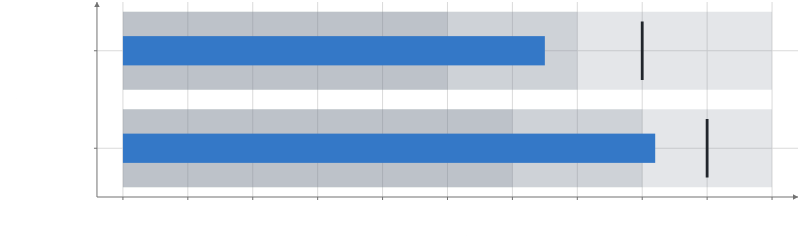 Static preview
; loading the interactive plot
<script>
  import { Plot } from "hmplot";
  import { BulletChart } from "hmplot/charts";
  const data = { metric: ["Revenue", "Renewals"], actual: [65, 82], goal: [80, 90],
    poor: [50, 60], fair: [70, 80], good: [100, 100] };
</script>

<Plot {data} height={250} axes2d x={{ label: "Percent of plan" }}>
  <BulletChart x="actual" y="metric" target="goal" fields={["poor", "fair", "good"]}
    tick={{ fill: "#20252b" }} />
</Plot>
Options
Options
targetchannel- Optional target value for each bullet.
fieldscolumn[]- Columns of cumulative qualitative upper bounds, all at or above baseline.
baselinenumber- The common starting value for actual and range bars. Default:
0. bandFractionnumber- The share of a category band occupied by the actual bar. Default:
0.3. rangesobject- Props of the background Bar part, such as fill, fillScale and opacity.
tickobject- Props of the target Prism part, such as fill, width and depth.
Position
xchannel- The actual value for each bullet.
ychannel- Each bullet's category along y.
Appearance
fillchannel- The fill color: a CSS color, or a column of numbers or categories mapped to colors.
opacitychannel- The opacity, 0 to 1: a number, or a column (categories map through opacityScale). Default:
1. outlineColorchannel- The outline's color: a CSS color, or a column of categories mapped through outlineColorScale.
outlineOpacitychannel- Border opacity from 0 to 1: a number, numeric column, array or expression. Fades the border over the fill; mark opacity still applies to both. Missing values hide the border. Default:
1. outlineWidthchannel- The outline's width in CSS pixels, drawn inside the mark's edge (a point's at most its radius). Default:
0.
Scales
fillScalescale- The fill's scale, which marks can share: continuous({domain, colormap, transform}) for numbers, categorical({domain, range}) or ordinal() for categories.
outlineColorScalescale- A categorical() scale from the outlineColor column's categories to colors.
opacityScalescale- A categorical() scale from the opacity column's categories to opacities, 0 to 1.
Display
labelstring- The mark's name in the legend and the settings pane.
legendboolean- Whether the mark has a legend entry. Default:
true. visibleboolean- Whether the mark is drawn. Default:
true. domainsboolean- Whether the mark's data counts toward its axes' automatic domains; false leaves them to the other marks (a reference line, a decorative part). Default:
true. blend"normal" | "additive" | "multiply" | "screen" | "subtractive"- How the mark mixes with what is drawn under it; any mode but normal draws it transparent, and SVG and PDF exports draw additive and subtractive as an image. Default:
"normal". glownumber- How much the mark glows: its own color times glow blooms around it in the plot's presentation (0 does not glow); the Plot's bloom effect sets the bloom's strength and radius. SVG and PDF exports draw the whole plot as an image. Default:
0. shadeShadeSpec- A plugin's shade (registerPlugin): { kind, ...parameters }, as { kind: "hatch", spacing: 6 } (Python hm.shade("hatch", spacing=6)), recolors each fragment the mark draws; picking, tooltips, domains and legends are unchanged. SVG and PDF exports draw a shaded mark as an image.
optionsstring[]- The settings the settings pane shows for this mark, by name.
namestring- The mark's name in the settings pane, and the name facet.endpoint() and partition.endpoint() find it by.
Interaction
identityidentity- Whose rows these are for selections: an identity() shared by tables that show the same things. Default: its data's.
selectboolean | selection | object- Click to replace the selection; an exact repeat clears it. Shift/Meta/Ctrl-click toggles membership (whole series for Line, Area): true uses its data's selection, or give a selection(). input("root").set("id") writes an input instead: a click sets it to the clicked row's id (a drill-down's root), .set(literal(v)) to a constant, .reset() to its default, and a click on nothing restores its default (input("root", {default}), else a Select of that name's, else null); several marks may write one input.
hoverboolean | selection | object- Mark the row under the pointer as @hovered (a whole series for Line, Area), without fading the others: true uses its data's hover, or give a selection(). input("focus").set("series") writes an input instead: while the pointer is on a row the input shows its series (or .set(literal(v)), a constant), then its committed value again (a hover that would change this mark's own rows is an error).
tooltipboolean | field[] | object- Show the nearest row's values in a box by the pointer: true, a list of fields, or {fields, radius, content}. Default: the Plot's.
nearestboolean | selection | object- Mark the row a tooltip shows as @nearest, with or without the tooltip: under the pointer, else the nearest drawn row within radius pixels (a whole series for Line, Area): true, a selection(), or {selection, radius}. Default: the Plot's.
respondboolean | "selected" | "brushed" | "hovered" | "nearby" | "nearest" | selection | array- Which interaction states fade this mark's other rows to selectionOpacity; "hovered" fades them while hovering, "nearest" while a row is nearest. Default: the states it sets, except hover and nearest.
selectionOpacitynumber- The opacity of the rows outside the selection while one is active. Default:
0.25. onclick(event) => void- Called for click on this mark; row provenance is optional after transforms.
ondblclick(event) => void- Called for dblclick on this mark; row provenance is optional after transforms.
oncontextmenu(event) => void- Called for contextmenu on this mark; row provenance is optional after transforms.
onpointerenter(event) => void- Called for pointerenter on this mark; row provenance is optional after transforms.
onpointerleave(event) => void- Called for pointerleave on this mark; row provenance is optional after transforms.
onpointermove(event) => void- Called for pointermove on this mark; row provenance is optional after transforms.
onpointerdown(event) => void- Called for pointerdown on this mark; row provenance is optional after transforms.
onpointerup(event) => void- Called for pointerup on this mark; row provenance is optional after transforms.
onpointercancel(event) => void- Called for pointercancel on this mark; row provenance is optional after transforms.
onpointerover(event) => void- Called for pointerover on this mark; row provenance is optional after transforms.
onpointerout(event) => void- Called for pointerout on this mark; row provenance is optional after transforms.
onpointermissed(event) => void- Called for pointermissed on this mark; row provenance is optional after transforms.
enterEffectboolean | "fade" | object- How rows that arrive in a keyed update appear: "fade", or {effect, duration, easing}. animate()'s enter option is the value a channel starts from.
exitEffectboolean | "fade" | object- How rows that leave in a keyed update disappear, as enterEffect. animate()'s exit option is the value a channel ends at.
Animation
animationboolean- Animate changes to the mark's values. Default:
false. animationDurationnumber- How long an animated change takes. Default:
300ms. animationEasing"linear" | "quad-in" | "quad-out" | "quad-in-out" | "cubic-in" | "cubic-out" | "cubic-in-out" | "sine-in-out"- The animation's easing. Default:
"cubic-in-out".
Legend settings
legendFontSizenumbersetting- The size of the mark's legend text. Default: the theme's (14 in the default theme). In px.
legendFontFamilystringsetting- The font of the mark's legend text, a CSS font-family. Default: the plot's font.
legendTextColorcolorsetting- The color of the mark's legend text. Default:
"#40505d". legendTickFormatstringsetting- How a colorbar labels numbers: a d3-format string, or a %-pattern for dates. Default:
".3~g".
Color settings
quantizebooleansetting- Step a numeric fill or color into `levels` colors instead of a smooth gradient. Default:
false. levelsnumbersetting- How many colors quantize steps through. Default:
10.
Limits
maxElementsnumbersetting- The most rows the mark prepares on the GPU. Default:
250000.
The mark's own axes
xTransform"linear" | "log" | "sqrt" | "symlog"setting- This mark's own x transform, instead of its frame's. Default: its frame's.
xInvertbooleansetting- Reverse this mark's x direction. Default:
false. xbounds[number, number]setting- The x extent this mark maps, instead of its frame's domain (an image's or a grid's extent). Default: its frame's.
xrange[number, number]setting- Where this mark's x extent lands, in its frame's world units. Default: its frame's.
yTransform"linear" | "log" | "sqrt" | "symlog"setting- This mark's own y transform, instead of its frame's. Default: its frame's.
yInvertbooleansetting- Reverse this mark's y direction. Default:
false. ybounds[number, number]setting- The y extent this mark maps, instead of its frame's domain (an image's or a grid's extent). Default: its frame's.
yrange[number, number]setting- Where this mark's y extent lands, in its frame's world units. Default: its frame's.
zTransform"linear" | "log" | "sqrt" | "symlog"setting- This mark's own z transform, instead of its frame's. Default: its frame's.
zInvertbooleansetting- Reverse this mark's z direction. Default:
false. zbounds[number, number]setting- The z extent this mark maps, instead of its frame's domain (an image's or a grid's extent). Default: its frame's.
zrange[number, number]setting- Where this mark's z extent lands, in its frame's world units. Default: its frame's.
Shading
transparentbooleansetting- Draw the mark in the transparent pass, blended in depth order with other transparent marks. Default:
false.
Usage
Each row supplies actual x, category y, and optionally target. fields is a list of columns containing qualitative upper bounds, such as ["poor", "fair", "good"]; omit it to omit the ranges. Bounds must be at or above baseline and describe cumulative ranges from it. Fold and Sort draw the largest background bar first, with alpha layering distinguishing the smaller ranges; bounds need not be passed in order. Missing bounds are not drawn. Main-part props style the actual horizontal Bar; ranges={...} styles its background Bars and tick={...} styles the target Prism. The tick is 0.6 category bands high and 0.4% of the visible x span wide; its width/depth can be overridden in the tick part, in data units. Values and bounds are supplied, never estimated. Keep one row per bullet; repeated categories overlap. Use Plot for axis/domain settings.
BulletChart is a chart: a template over public components, defined in one file, src/lib/charts/bulletChart.js.